A product people need training to use
Support tickets cluster on the same three screens. The redesign removes the choices that were never real and gives each screen one obvious next step.
UX work here follows BASIC UX, a five-principle framework we maintain and publish: beauty, accessibility, simplicity, intuitiveness, consistency. Having it written down means a design review is an argument about principles rather than about taste.
The most common finding is not that a screen is ugly. It is that it offers eleven equally weighted choices, so every visit starts with a decision nobody wanted to make. Cutting to one clear primary action per view usually does more for completion rates than any visual change.
Accessibility is part of the same pass rather than a later audit. Contrast ratios, keyboard paths, focus states, real alt text, and reduced-motion behavior get checked while the design is still cheap to change.
Support tickets cluster on the same three screens. The redesign removes the choices that were never real and gives each screen one obvious next step.
Four button styles, six greys, and radius values nobody can explain. Consolidating to one scale makes every future screen faster to build.
A customer could not complete a form with a screen reader. The review finds the cause, fixes it, and checks the rest of the flows for the same pattern.
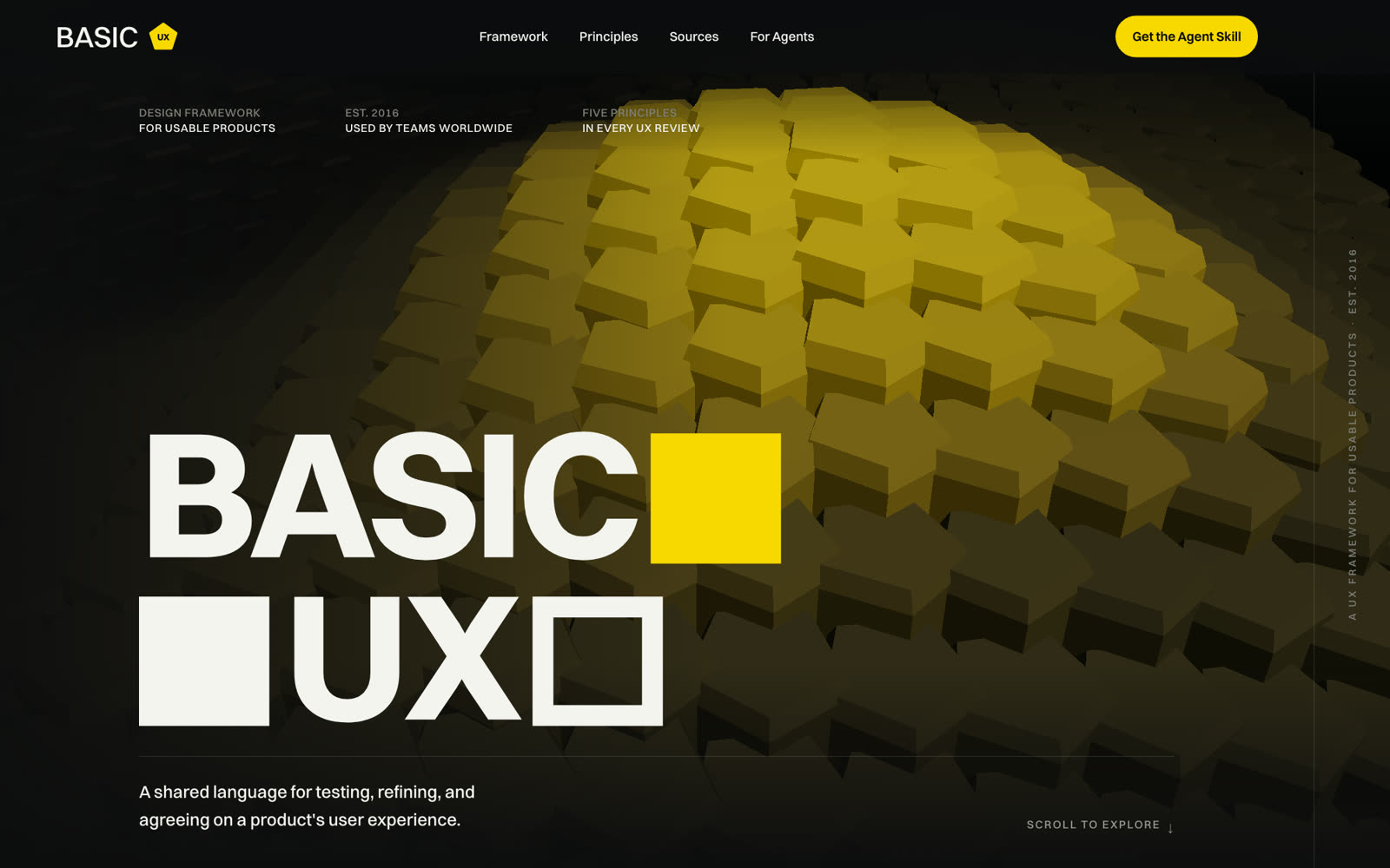
A UX framework we have maintained since 2016: five principles and a shared language for judging a product's user experience, now with an agent skill for AI-assisted UX review.

A map-based marketplace where creators and small businesses show their work, sell, and get booked by people nearby. Built as an installable web app, so there is no app store between someone hearing about it and using it.
Early access. Accounts and the feed run on live data; the public launch hasn't happened yet.

Discovery calls are free and usually last 30 minutes. We listen first, and we will tell you honestly if ux design is the wrong thing to spend money on.